Case Study · 2025
VITAM × JKI Brand StudiosVITAM
The Brief
VITAM came to JKI Brand Studios with a clear consumer insight and an unsolved design problem: the person who lives actively but doesn't want to choose between recovery and relaxation. That in-between hour — workout done, day not quite over — had no beverage built for it. VITAM was the answer.
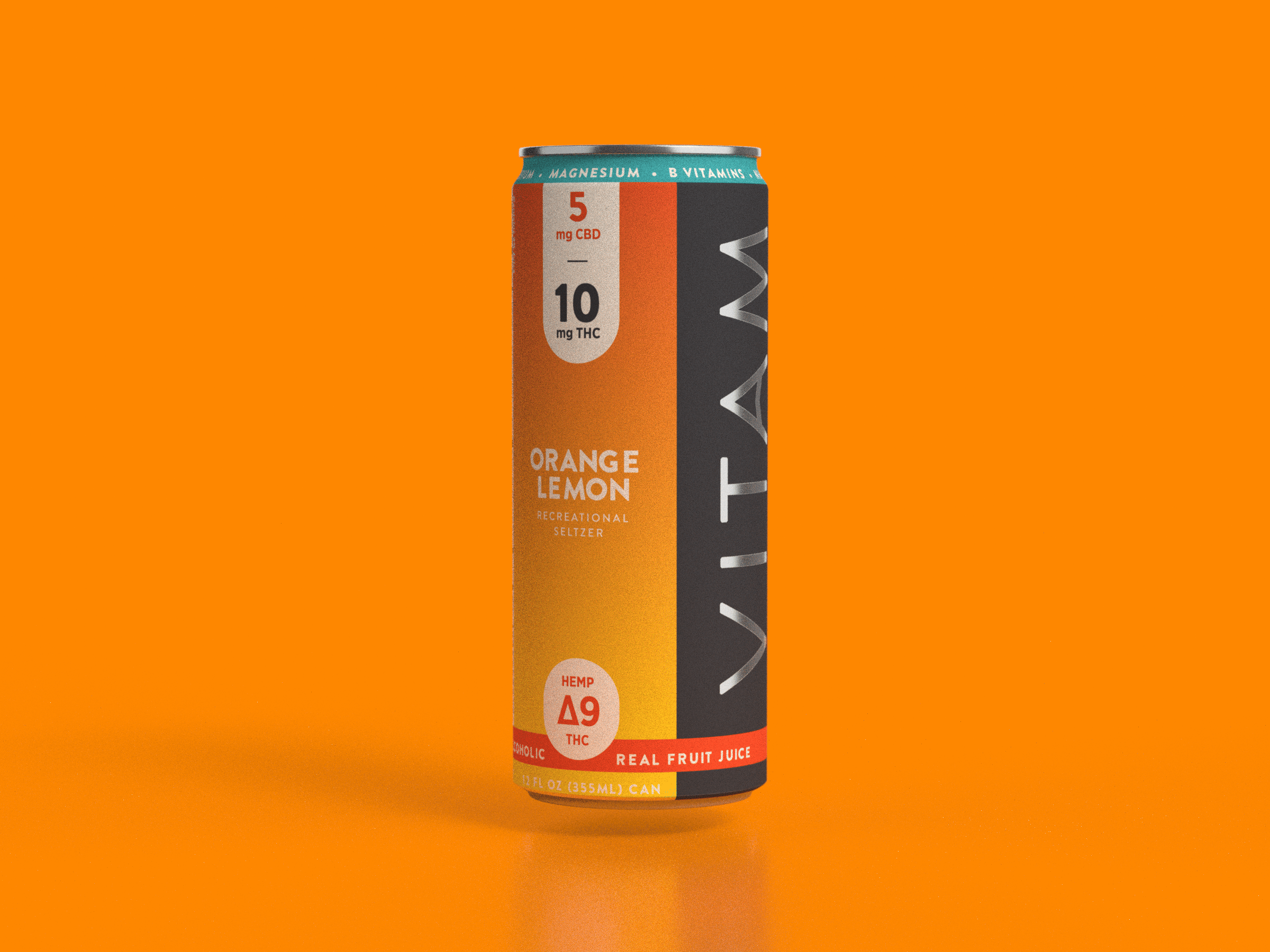
Formulated with 5 mg hemp-derived THC, B Vitamins, and electrolytes, VITAM needed a brand system that could speak to both a functional athlete and a wellness-minded consumer simultaneously. The design had to work as hard as the formula — clean, confident, and built to earn shelf space in an increasingly crowded functional beverage category.
JKI Brand Studios designed the full creative direction and brand identity system from the ground up — logo, color system, packaging design, product architecture, and line extensions — all calibrated to communicate one clear signal: easy recovery, earned calm.
Designed By JKI
JKI Brand Studios led brand strategy, creative direction, and the full visual identity system for VITAM. Starting from a formulation brief and a consumer moment, JKI built the complete brand architecture — positioning, logo mark, color palette, typography system, and a packaging design language built to scale across SKUs.
Line extensions were developed with retail environments in mind, with each flavor designed to hold its own at shelf while reading as a cohesive family. Every retail asset was built around the same positioning: performance and calm don't have to compete.
Moment Architecture
the in-between hour5PM on a Wednesday After a Workout
Most functional beverages design for the extremes — the peak performance moment or the full wind-down. VITAM was built for neither. It was built for the middle: workout done, responsibilities still hovering, the body starting to decompress while the mind hasn't quite let go yet.
That specificity — 5PM, Wednesday, post-workout — isn't just a marketing frame. It's the design brief. Every visual decision was made in service of that consumer at that exact moment: someone who earned this, who wants to feel it, who doesn't want to think too hard about it.
The brand language had to be bold enough for an active lifestyle brand, clean enough for a wellness positioning, and calm enough to deliver on the promise. Bold color blocking. Confident typography. A can that looks like it belongs in your gym bag and on your kitchen counter.
01
Consumer Signal
Active adults who live intentionally — they track their workouts, read labels, and want products that reflect who they are. They're not choosing between performance and wellness. They expect both.
02
The Occasion
The 60 minutes after a workout and before the evening begins. Not recovery in bed. Not celebration with friends. The quiet, earned in-between that belongs entirely to the person who just showed up for themselves.
03
The Ingredient Logic
5 mg hemp-derived THC, B Vitamins for cellular energy metabolism, electrolytes for genuine hydration. A functional stack that earns its label — not wellness theater, but a formula that works as hard as the consumer who's drinking it.
04
The Brand Signal
Easy recovery, earned calm. A design system that reads athletic without screaming it — clean lines, confident color blocking, typography that holds authority at shelf. Built to scale across a full line extension architecture.


Systems Delivered
Brand
Design
Go-to-Market
Designed By
JKI Brand Studios
Brand Strategy & Creative Direction
James Kennedy / JKI Brand Studios
Visual Identity & Packaging
JKI Brand Studios
Client
VITAM
Product
VITAM Recreational Seltzers